This week, I spotted an article by Bookbub on eight trends for covers that sell books.
The key elements to lure readers? Animals, beaches, seasonal themes, friendship/sisterhood, shirtless men, great photography, chicklit glitter and cute kids.
Sure, I get that. Certain readers will buy stuff that guarantees satisfaction – stuff that does what it says on the tin. Yet I scrolled through those covers and not one appealed to me. No surprise there. I loathe anything mawkish or sentimental, rarely read chicklit/romance/erotica and I’m drawn to covers which promise beauty, intelligence, new ideas and experiences.
I know very little about design, but as a reader, I do judge books by their covers. Never one to keep my opinions to myself, here are ten indie-published covers which appealed to my own personal predelictions. In no particular order, this is my own subjective beauty parade with links to the designers.
by Jim Williams
Beautiful use of perspective and depth of field. Not to mention the glorious colours and light.
The positioning of the dramatic items in the foreground stand out against the inky canal and the Caravaggio lure of Venetian architecture is just irresistible.
*Covetous sigh*
by Jenny Bravo
That cover is a story in itself and suits the title to a T. A broken chain, a lop-sided swing… something is going to happen. The typeface also reminds me of the Jonas Jonasson books, hence the suggestion of quirkiness. I have no idea what the book is about but on the strength of this image, I’d want to find out.
by Jessica Bell
Wonderful balance of images, colour and surreal swathe of flaming hair. What’s she doing? Running, dancing?
The juxtaposition of differing fonts not only adds interest but hints at a similar boldness within.
How could one resist picking this up?
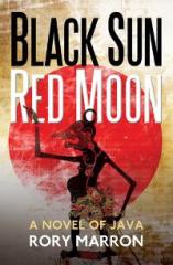
Black Sun, Red Moon
by Rory Marron
This book promises to take me to another place and inside a different culture. and I’m intrigued by the figure.
The slightly distressed nature of the background adds a parchment-like texture and the typeface against contrast backgrounds is striking.
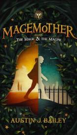
by Austin J. Bailey
This appeals to the child in me.
Doorways, the promise of change, forests and a bell with magic hinted at by the Potteresque font.
There’s a lot going on here, but it all works and excites curiosity. And didn’t I read somewhere that turquoise/yellow is an appealing combination?
by Jane Davis
Elegant, intriguing and atmospheric. The image evokes thoughts of Shakespeare and the Penguin Café Orchestra. The shades of blue, as if the figure were subtly spotlit, the choice of delicate motifs such as rose stems, deer and ballet combine to lure you in, convinced the story must be equally beautiful.
by Clare Flynn
I’m not usually keen on having faces on the cover as I prefer to invent my own image of the characters. But I do love maps and greenery. For me, the 50s-style portrait, sliver of map and suggestion of landscape work perfectly here. The font is elegant and gives us an idea of the kind of story to expect. As with Black Sun, Red Moon above, the whole package tells us we’re going otherwhere and otherwhen.
 We All Reach the Earth by Falling
by Bauke Kamstra
OK, the title would be enough to draw me closer, but the texture makes me want to grab this. Those feathers overlapping some of the letters is subtle and understated. The title is also perfectly balanced, leading me to imagine the poems within will be equally so. These colours remind me of Al Brookes’s The Gift of Looking Closely, another plus.
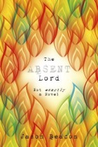
by Jason Beacon
Initially attracted because it bears some similarity to Ben Okri’s The Famished Road, I like everything about this,
The leaves/flames forming a frame, autumnal tones, the typewritten title and the way the light catches the eye all hint at a story within. Plus that strapline couldn’t fail.

With this Curse
by Amanda DeWees
The author has a whole series of these books, employing the same technique of silhouetted head as portal. They look fabulous.
This one is extremely classy, giving you the genre, central character and sense of polish in the way the cover is edged. You immediately know there is a world within and can’t wait to dive in.
There. Those were a few of my favourites. You?


